I just finished reading LYCC, and it was an emtional ride. Hear me out. Francis Bass, if you're reading this, I by no means mean any offense.
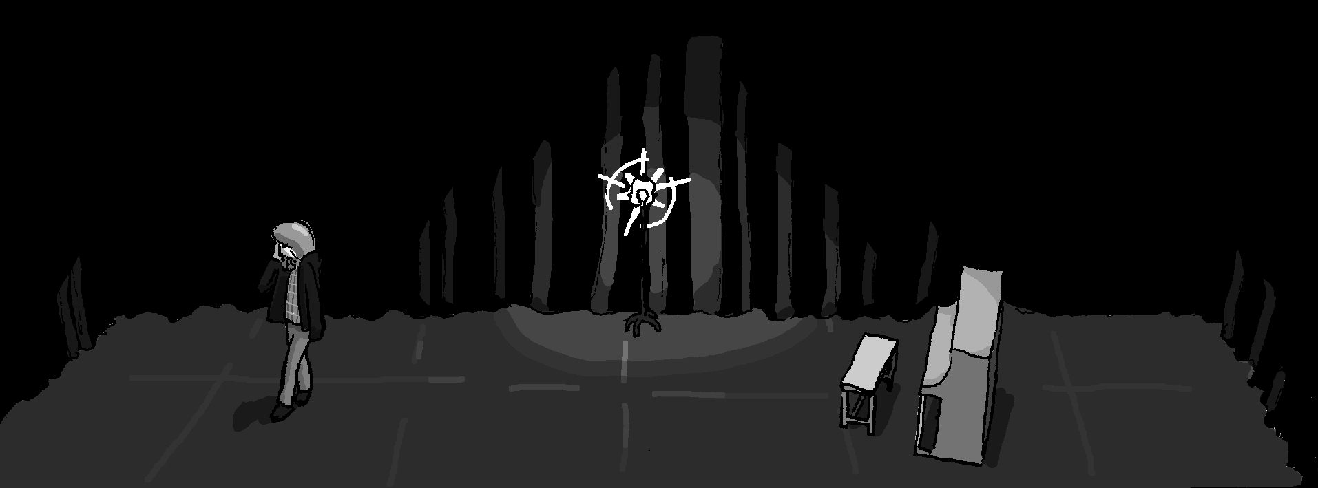
The art was not great, especially at the start. Hell, I wanted to quit because of how illegible the writing was at times. But then, everything starts to get better. The art has better shading, is clearer and more clean looking, and the writing becomes better. The ending formed a huge lump in my throat, as there was a certain charm/emotional toll to it.
I like how you draw. I can see you improve as you work on newer chapters. The shading and highlighting definitely add a lot, and are clearly worth it. The book begins to look like "ZeroCalcare", an Italian serialized cartoon. While there is no overarching story, I can still say the end really made an impact.
On the other hand, Last Summer felt unpolished and rushed. A lot of the time I couldn't even tell what was going on, especially with the writing.
Overall, this feels like a work in progress, and could really be something in the future. I would suggest creating your own font to make the writing more legibile whilst still being personalized (Tom Gates is a good example of this), as well as getting a drawing tablet to make everything faster and look cleaner. With a bit of practice, I think you could be great! To Francis Bass, I wish you the best of luck, and hope you are settling well in Philadelphia by the time you are reading this.
← Return to comic
Comments
Log in with itch.io to leave a comment.
I just finished reading LYCC, and it was an emtional ride. Hear me out. Francis Bass, if you're reading this, I by no means mean any offense.
The art was not great, especially at the start. Hell, I wanted to quit because of how illegible the writing was at times. But then, everything starts to get better. The art has better shading, is clearer and more clean looking, and the writing becomes better. The ending formed a huge lump in my throat, as there was a certain charm/emotional toll to it.
I like how you draw. I can see you improve as you work on newer chapters. The shading and highlighting definitely add a lot, and are clearly worth it. The book begins to look like "ZeroCalcare", an Italian serialized cartoon. While there is no overarching story, I can still say the end really made an impact.
On the other hand, Last Summer felt unpolished and rushed. A lot of the time I couldn't even tell what was going on, especially with the writing.
Overall, this feels like a work in progress, and could really be something in the future. I would suggest creating your own font to make the writing more legibile whilst still being personalized (Tom Gates is a good example of this), as well as getting a drawing tablet to make everything faster and look cleaner. With a bit of practice, I think you could be great! To Francis Bass, I wish you the best of luck, and hope you are settling well in Philadelphia by the time you are reading this.
yes, this comic was definitely a uhhh learning experience, from beginning to end. i'm glad you stuck with it and got something out of it!